An Unconventional Valentine's Day Color Palette
- Feb 12
- 2 min read
This Valentine's Day, we chose to step away from the expected.
Red will always have its place in the language of romance. But love, in its truest form, is layered, complex, surprising. It is soft and bold. Quiet and dramatic. Tender and fearless. This year, we found our inspiration in that complexity and invited four extraordinary designers to explore an unconventional Valentine's Day color palette using our garden roses.
Instead of tradition guiding the story, we let color, texture and emotion lead. What unfolded was a series of interpretations that felt deeply personal, expressive and beautifully unexpected.
With a sculptural gold vessel and luminous movement, Canaan Marshall approached the unconventional palette with fearless artistry. Peach, coral, blush and soft butter tones danced together in a composition that felt joyful and unapologetically expressive. His design proved that Valentine's Day doesn't need to whisper in crimson to feel romantic; it can glow in warmth, personality and bold intention. The arrangement radiated confidence, reminding us that love can be vibrant and expansive.
Where Canaan explored radiance, Nancy Zimmerman of Fancy Florals by Nancy leaned into intimacy. She interpreted the palette through a softer, more intimate lens. Her arrangement felt like a love letter written slowly, layered with thoughtful garden roses, fresh green textures and gentle movement. There was something beautifully grounded in her approach. It felt familiar in the best way; the unconventional tones became serene and timeless.
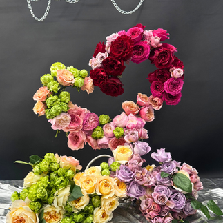
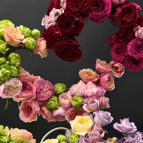
In contrast, Jake Kale of Cobra Lily introduced tension and structure. Making something not only unconventional in palette but in structure and space. His sculptural work with garden roses embraced contrast, deep reds, vivid pinks, pale blush and green buds, intertwining in a bold shape that evokes movement and emotion. The design felt dynamic, architectural and daring. It challenged the softness typically associated with Valentine's Day, transforming romance into something graphic and unforgettable. In Jake's interpretation, love is a daring statement.
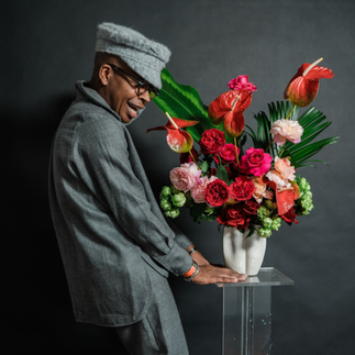
Ace Berry brought yet another perspective: modern, refined and richly layered. Creamy garden roses and soft lavender tones met moodier blooms and striking textural greens, creating a design filled with movement and intention. Airy branches and layered petals drew the eye in.
This campaign was never about abandoning tradition; it was about expanding it. By choosing an unconventional palette, we gave ourselves permission to explore love in all its tones. From softness to strength, from intimacy to drama, each designer revealed a different emotional language through garden roses.
What moved us most was not just the color stories but the individuality behind them. The same palette became four completely distinct expressions – proof that creativity flourishes and that any interpretation is completely valid and beautiful. In every arrangement, we saw courage, tenderness, personality and intention.
Challenging our creativity helps us connect more deeply with what Valentine's Day means: a feeling of connection that shouldn't be defined by a single shade or tradition. This Valentine's Day, we chose to celebrate that freedom, honoring romance not as something expected, but as something deeply personal and beautifully reimagined.


